


This guide explains how to annotate bars in a Pandas bar plot to display their values.
When to Annotate a Bar Plot?
Annotations are useful when:
- You want to display exact values on the bars instead of relying on the y-axis
- The differences between values are small, making it hard to compare visually
- You need to highlight specific data points in reports or dashboards
Steps to Annotate Bars in a Bar Plot
- Import the required libraries (
pandasandmatplotlib) - Create a DataFrame with categorical data
- Use
DataFrame.plot(kind='bar')to generate a bar plot - Iterate through the bars and use
ax.text()to annotate them - Show the plot using
plt.show()
More information can be found: Pandas DataFrame.plot
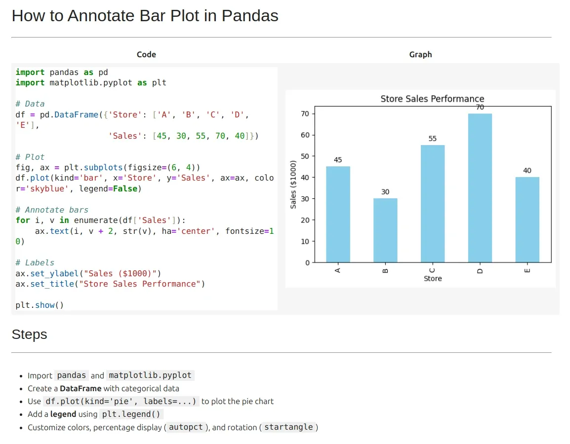
Data: Sales Performance of Stores
This dataset contains sales revenue (in thousands of dollars) for different stores.
| Store | Sales (in $1000) |
|---|---|
| Store A | 45 |
| Store B | 30 |
| Store C | 55 |
| Store D | 70 |
| Store E | 40 |
Example: Annotating Bars in a Bar Plot
import pandas as pd
import matplotlib.pyplot as plt

# Create DataFrame with sales data
df = pd.DataFrame({'Store': ['Store A', 'Store B', 'Store C', 'Store D', 'Store E'],
                   'Sales': [45, 30, 55, 70, 40]})

# Create bar plot
fig, ax = plt.subplots(figsize=(8, 5))
df.plot(kind='bar', x='Store', y='Sales', ax=ax, color='skyblue', legend=False)

# Annotate bars with values
for index, value in enumerate(df['Sales']):
    ax.text(index, value + 2, str(value), ha='center', fontsize=12)

# Set labels and title
ax.set_ylabel("Sales ($1000)")
ax.set_title("Sales Performance by Store")

plt.show()
Output
- The bar plot displays sales revenue for each store.
- The exact sales values are annotated above each bar.
Customizing the Annotations
- Adjust the position of text by modifying
value + 2 - Change the font size using
fontsize=12 - Align text using
ha='center'(horizontal alignment)
ax.text(index, value + 2, str(value), ha='center', fontsize=12, color='red')