


A Choropleth Map is a geographical visualization where different regions are shaded or colored based on data values. It is widely used to visualize population density, economic data, or other spatial patterns.
In this post we will see how to plot a Choropleth Map in Python and Pandas.
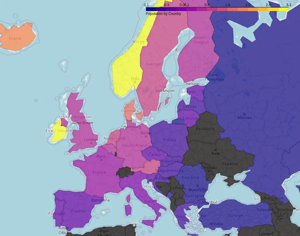
Check this if you want to find out how to scrape wiki tables and customize Choropleth map.
You can find the Choropleth for GDP of Europes countries:
Why Use Choropleth Maps?
- Visualizes spatial trends in data across regions
- Helps in decision-making for businesses and governments
- Enhances geographical storytelling in reports and presentations
- Easy to integrate with interactive dashboards
Steps to Create a Choropleth Map in Python
- Import required libraries
folium,plotly.express - Load shapefile or GeoJSON data for boundaries
- Load data to visualize (e.g., population, GDP, COVID cases)
- Merge data with geographical boundaries
- Use Folium or Plotly to create the Choropleth map
- Customize colors, tooltips, and interactivity
More details: Plotly Choropleth Documentation
Note: installation:
pip install foliumpip install plotly
Dataset: World Population by Country
We'll use the GeoJSON file for world boundaries and a sample dataset containing population per country.
Example 1: Choropleth Map Using Plotly
import plotly.express as px
import pandas as pd

# Load sample data (country population)
df = pd.DataFrame({
    "Country": ["United States", "Canada", "Brazil", "Germany", "India"],
    "Population": [331000000, 37700000, 212000000, 83000000, 1380000000]
})

# Create Choropleth map
fig = px.choropleth(df,
                    locations="Country",
                    locationmode="country names",
                    color="Population",
                    color_continuous_scale="Viridis",
                    title="World Population Map")

fig.show()
Output
An interactive world map where countries are shaded based on population size.
Example 2: Choropleth Map Using Folium
import folium
import json
import pandas as pd

# Load sample dataset (Country Population)
df = pd.DataFrame({
    "Country": ["United States", "Canada", "Brazil", "Germany", "India"],
    "Population": [331000000, 37700000, 212000000, 83000000, 1380000000]
})

# Load GeoJSON file for country boundaries
geojson_url = "https://raw.githubusercontent.com/johan/world.geo.json/master/countries.geo.json"

# Create base map
m = folium.Map(location=[20, 0], zoom_start=2)

# Add Choropleth layer
folium.Choropleth(
    geo_data=geojson_url,
    name="Population",
    data=df,
    columns=["Country", "Population"],
    key_on="feature.properties.name",
    fill_color="YlGnBu",
    fill_opacity=0.7,
    line_opacity=0.2,
    legend_name="Population by Country",
).add_to(m)

# Display map
m.save("choropleth_map.html") # save to a file
m.show_in_browser() # load in a browser
Output
A Folium-based Choropleth map saved as an HTML file with interactive zoom and tooltips.
Customizations
- Change color scale:
"Blues","Reds","Viridis","Plasma"
- Add tooltips for extra details
- Use different map projections for world or region-based visualizations