


To improve readability in Plotly's Sunburst Diagram, we need a way to wrap text inside the chart. This is needed when work with long text labels which get cut off sometimes. We can fix the issue by using simple method:
def customwrap(s,width=30):
    return "<br>".join(textwrap.wrap(s,width=width))
Ways to Wrap Text in a Sunburst Diagram
Since Plotly does not support direct text wrapping, we can use the following techniques:
- Insert Line Breaks (
<br>) in Labels - Use
texttemplateto Format Labels
Data
We are going to use the following data:
import pandas as pd

df = pd.DataFrame({
    "labels": ["Sales Department", "Sales Department", "Marketing Team", "Software Engineering",
               "Software Engineering", "Sales Department"],
    "parents": ["Company1", "Company1", "Company2", "Company2", "Company1", "Company1"],
    "people": ["Augustus Caesar Augustus", "Tiberius Caesar Augustus", "Caligula Gaius Caesar Augustus Germanicus",
               "Claudius Tiberius Claudius Caesar Augustus Germanicus", "Nero Claudius Caesar", "Galba Servius Galba Caesar"]
})

df
data:
| labels | parents | people | people adj | |
|---|---|---|---|---|
| 0 | Sales Department | Company1 | Augustus Caesar Augustus | Augustus Caesar<br>Augustus |
| 1 | Sales Department | Company1 | Tiberius Caesar Augustus | Tiberius Caesar<br>Augustus |
| 2 | Marketing Team | Company2 | Caligula Gaius Caesar Augustus Germanicus | Caligula Gaius<br>Caesar Augustus<br>Germanicus |
| 3 | Software Engineering | Company2 | Claudius Tiberius Claudius Caesar Augustus Germanicus | Claudius Tiberius<br>Claudius Caesar<br>Augustus Germanicus |
| 4 | Software Engineering | Company1 | Nero Claudius Caesar | Nero Claudius Caesar |
Example: Wrapping Text in a Sunburst Chart
First we are going to change the labels for the outmost values to wrap in a given lenght by:
import textwrap
def customwrap(s,width=20):
    try:
        return "<br>".join(textwrap.wrap(s,width=width))
    except:
        return None

df['people adj'] = df['people'].map(customwrap)
then we are going to plot the Sunburst diagram:
import plotly.express as px
fig2 = px.sunburst(df, path=['parents', 'people adj'], color= 'labels')
fig2.update_layout(title_text="Wrap up text ", font_size=15,
                  width=500, height=500)
fig2.show()
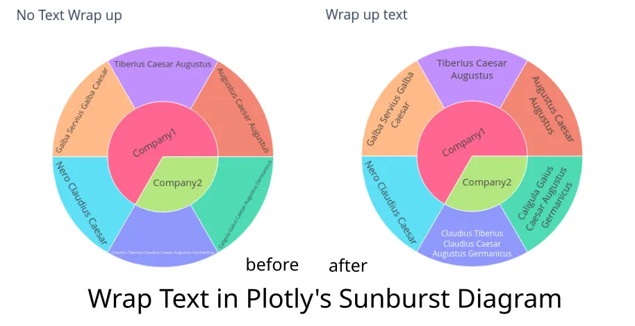
You can compare the results below:
Resources
This post is inspired by:
Conclusion
Although Plotly does not support automatic text wrapping, using wrap with line breaks (<br>) significantly improves label readability in Sunburst Charts.