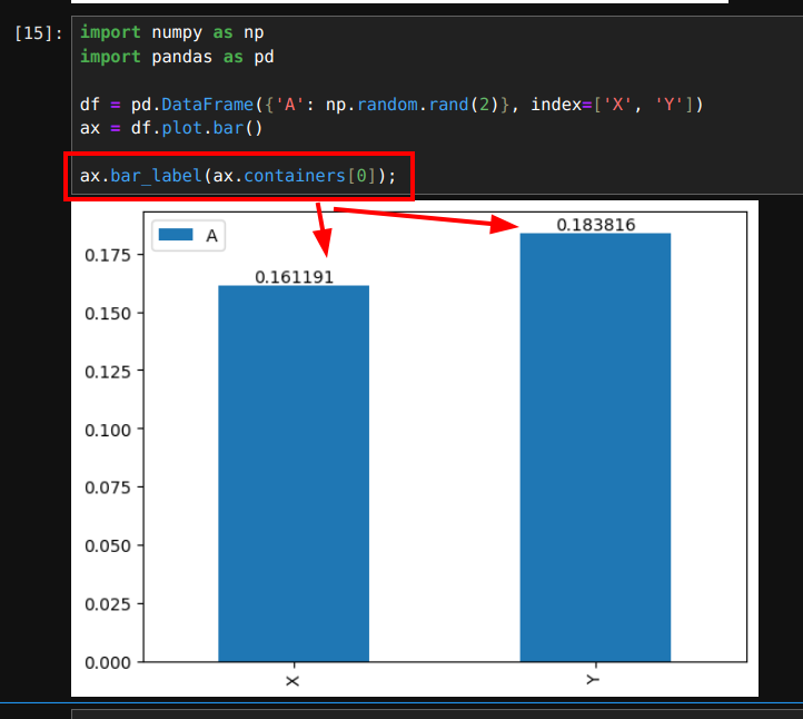
Adding annotations (bar values) to Pandas plot can be done by using ax.bar_label(ax.containers[0]):
import numpy as np
import pandas as pd

df = pd.DataFrame({'A': np.random.rand(2)}, index=['X', 'Y'])
ax = df.plot.bar()

ax.bar_label(ax.containers[0])
result:
Steps to Annotate Bars on a Pandas Bar Plot
- Import the required libraries
pandasandmatplotlib - Read a Pandas DataFrame containing the data
- Use a function to generate a bar plot like:
3.1.plot(kind='bar')
3.2.plot(kind='barh') - Iterate through the bars and use
ax.text()to add annotations. - Customize the annotations:
- position
- font size
- color
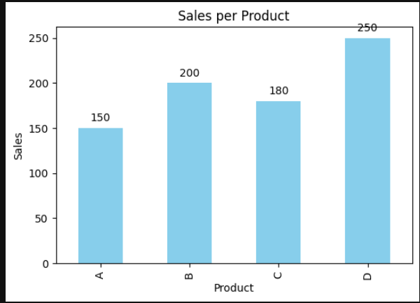
Example Data
Let's consider a dataset representing sales figures for different products:
| Product | Sales |
|---|---|
| A | 150 |
| B | 200 |
| C | 180 |
| D | 250 |
created by:
import pandas as pd
import matplotlib.pyplot as plt

# Example data
data = {'Product': ['A', 'B', 'C', 'D'],
        'Sales': [150, 200, 180, 250]}
Create an Annotated Bar Chart with Pandas and Python
import pandas as pd
import matplotlib.pyplot as plt

# Example data
data = {'Product': ['A', 'B', 'C', 'D'],
        'Sales': [150, 200, 180, 250]}

# Create DataFrame
df = pd.DataFrame(data)

# Create a bar plot
fig, ax = plt.subplots(figsize=(6, 4))
bars = df.plot(x='Product', y='Sales', kind='bar', ax=ax, color='skyblue', legend=False)

# Annotate each bar with its value
for bar in ax.patches:
    ax.text(bar.get_x() + bar.get_width()/2,  # X-coordinate (center of the bar)
            bar.get_height() + 5,              # Y-coordinate (height of the bar + offset)
            f'{bar.get_height()}',             # Text to display
            ha='center', va='bottom',          # Horizontal and vertical alignment
            fontsize=10, color='black')        # Font size and color

# Add labels and title
ax.set_title('Sales per Product')
ax.set_xlabel('Product')
ax.set_ylabel('Sales')

# Show the plot
plt.show()
Explanation of the Code
- Generate a Bar Plot: The
df.plot(kind='bar')function is used to create the bar chart. - Loop Through Bars: Using
ax.patches, we iterate over the bars to retrieve their heights (sales values). - Annotate Bars: The
ax.text()function places numerical values on top of the bars. - Customize Annotation: We adjust the text alignment and offset to improve readability.
Output
This will generate a bar chart where each bar has its corresponding sales value displayed above it.
By customizing the offset, font size, and color, you can improve the visual appeal and readability of the annotations in different use cases.