


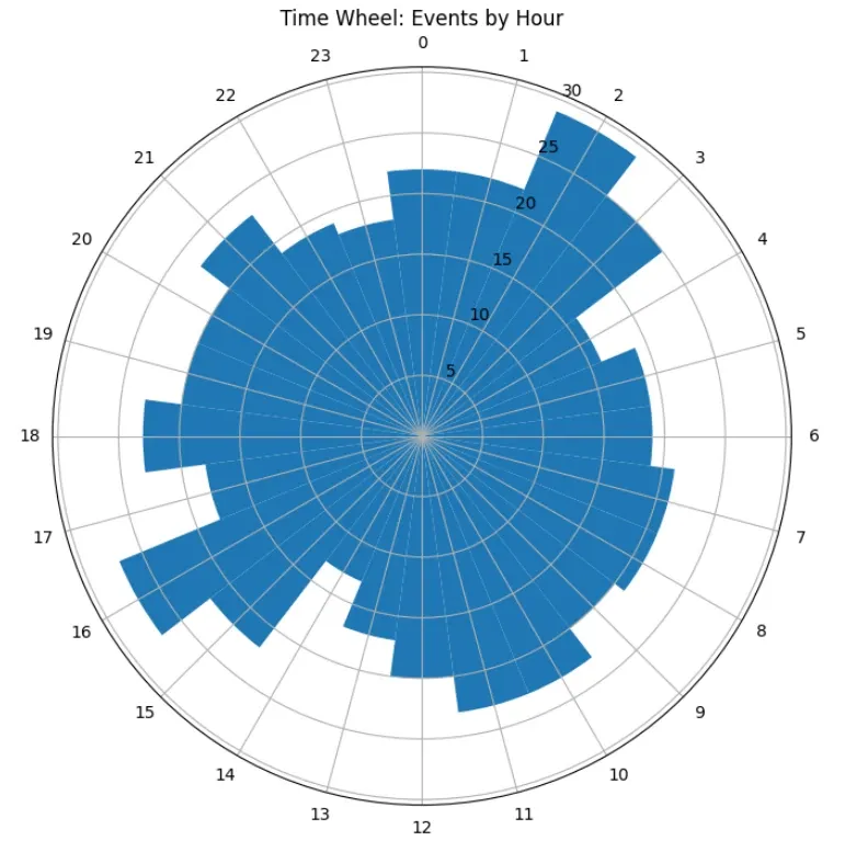
A Time Wheel (also known as a circular time or polar plot) visualizes temporal patterns over a 24-hour cycle. It’s useful for spotting hourly trends-like activity peaks throughout the day-by arranging data around a circle.
When to Use a Time Wheel?
- Hourly patterns: Check when events cluster in a day
- Cyclic behavior: Identify trends that repeat every 24 hours, day, month
- Activity analysis: Analyze server logs, transactions, or sensor data
- Visual clarity: Represent time in a circular 24-hour format
Steps to Create a Time Wheel Plot
- Import
pandasandmatplotlib - Load or create a dataset with timestamps
- Extract hour of day from timestamps
- Group data by hour and count occurrences
- Convert hours to angles (radians) for polar plot
- Use
ax.bar()on a polar axis to draw the time wheel
Data (Example: Random Timestamps)
| Index | datetime |
|---|---|
| 0 | 2025-01-01 00:15:00 |
| 1 | 2025-01-01 01:45:00 |
| 2 | 2025-01-01 13:30:00 |
| 3 | 2025-01-01 14:00:00 |
| 4 | 2025-01-01 23:50:00 |
Example: Time Wheel Plot with Pandas + Matplotlib
import pandas as pd
import numpy as np
import matplotlib.pyplot as plt


rng = pd.date_range("2025-01-01", periods=200, freq="h")
df = pd.DataFrame({"datetime": np.random.choice(rng, 500)})

# Extract hour of day
df["hour"] = df["datetime"].dt.hour

# Group by hour
hourly = df.groupby("hour").size().reindex(range(24), fill_value=0)

# Convert hours to radians (24 hours → 2π)
angles = 2 * np.pi * hourly.index / 24

# Create polar plot
fig, ax = plt.subplots(figsize=(8, 8), subplot_kw={"projection": "polar"})
bars = ax.bar(angles, hourly.values, width=2*np.pi/24, bottom=0.0)

# Optional styling
ax.set_xticks(angles)                       # Hour tick positions
ax.set_xticklabels(range(24))               # Hour labels 0–23
ax.set_theta_zero_location("N")             # Zero at top
ax.set_theta_direction(-1)                  # Clockwise direction
ax.set_title("Time Wheel: Events by Hour")

plt.show()
Output
This code produces a circular histogram of hourly event counts:
- Each bar represents one hour of the day
- Bar length indicates number of events
- Hours are arranged around a 24-hour clock
Customizations
-
Color map:
for bar, val in zip(bars, hourly.values): bar.set_facecolor(plt.cm.viridis(val / hourly.max())) -
Highlight peak hours:
bars[hourly.idxmax()].set_color("red") -
Add labels for totals:
for angle, count in zip(angles, hourly.values):
    ax.text(angle, count+2, str(count), ha="center", va="bottom")
Resources**
A Time Wheel effectively shows daily temporal patterns at a glance. You can adapt this approach to any dataset with timestamps!