


In this post we will use Choropleth Map to plot GDP data per capita. We will:
- collect data from wikipedia
- clean and normalize the data
- customize the Choropleth map for visual impact
Why Customize a Choropleth Map
- Enhances visual clarity and makes insights easier to interpret
- Improves color contrast for better differentiation of data values
- Adds tooltips and interactivity to make maps more engaging
- Allows regional filtering for better focus on specific areas
Steps to Customize a Choropleth Map in Python
- Import required libraries
folium(installation:pip install folium) - Load and prepare geographic data (GeoJSON or shapefiles)
- Load data to visualize (e.g., population, GDP, COVID cases)
- Customize:
- Color scales (
Viridis,Plasma,Blues,Reds, etc.) - Hover tooltips for additional insights
- Map projection types (
Mercator,Robinson,Mollweide) - Borders & line styles for better readability
- Color scales (
- Generate the interactive Choropleth map
More details: Plotly Choropleth Documentation
Read Wiki Data with Pandas
First we will collect the wiki tables from this page: List of countries by GDP (nominal) per capita
import pandas as pd

dfs = pd.read_html('https://en.wikipedia.org/wiki/List_of_countries_by_GDP_(nominal)_per_capita')
df = dfs[2][[('Country/Territory', 'Country/Territory'), (        'United Nations[7]',          'Estimate')]].droplevel(level=0,axis=1)
df.columns = ['Country','GDP']
df = df[df['GDP'].astype(str).str.isdigit()]
df['GDP'] = df['GDP'].astype(int)
df['GDP'] = (df['GDP'] - df['GDP'].mean())/df['GDP'].std()
df
Output
Colected data should be in this form:
| Country | GDP | |
|---|---|---|
| 0 | Monaco | 7.219065 |
| 1 | Liechtenstein | 5.805285 |
| 2 | Luxembourg | 3.473187 |
| 3 | Bermuda | 3.201031 |
| 4 | Switzerland | 2.419035 |
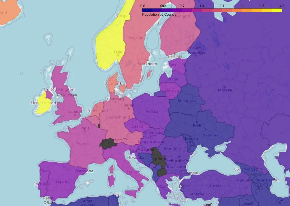
Customization Using Folium
This example customizes:
- Color Scale:
"YlOrRd"(Yellow-Orange-Red) - Hover Tooltips using
GeoJSONTooltip - Map Boundaries & Opacity Adjustments
- threshold_scale - number of categories
import folium
import json
import pandas as pd
import numpy as np

dfs = pd.read_html('https://en.wikipedia.org/wiki/List_of_countries_by_GDP_(nominal)_per_capita')
df = dfs[2][[('Country/Territory', 'Country/Territory'), (        'United Nations[7]',          'Estimate')]].droplevel(level=0,axis=1)
df.columns = ['Country','GDP']
df = df[df['GDP'].astype(str).str.isdigit()]
df['GDP'] = df['GDP'].astype(int)
df['GDP'] = (df['GDP'] - df['GDP'].mean())/df['GDP'].std()
df

geojson_url = "https://raw.githubusercontent.com/johan/world.geo.json/master/countries.geo.json"

m = folium.Map(location=[20, 0], zoom_start=2)

myscale = np.linspace(df['GDP'].min(), df['GDP'].max(), 15)

folium.Choropleth(
    geo_data=geojson_url,
    name="PopulaCountrytion",
    data=df,
    columns=["Country", "GDP"],
    key_on="feature.properties.name",
    fill_color="plasma",
    fill_opacity=0.7,
    line_opacity=0.2,
    legend_name="Population by Country",
    threshold_scale=myscale,
).add_to(m)

m.show_in_browser()
Output
A Folium-based Choropleth map with a plasma gradient with 15 levels and hover tooltips showing country names.