In this quick guide, we will learn how to create radar charts using Matplotlib in Python.
Radar chart (also known as a spider chart or web chart) can be plot by using:
plt.subplot(projection="polar")
or
plt.subplot(polar=True)
lines, labels = plt.thetagrids(np.degrees(label_loc), labels=categories)
It is useful for comparing multiple variables at once, often used in performance analysis, sports statistics, comparison and decision-making scenarios.
Steps to Create a Radar Chart
- Import required libraries:
matplotlib.pyplot - Define the categories (variables): The radar chart will plot data across multiple axes
- Convert category angles: Since a radar chart is circular, we convert categories into angles.
- Prepare data for plotting.
- Create and customize the radar chart: Use
plt.subplot(projection="polar")to create the plot.
Example: Radar Chart for Student Evaluation
Dataset
Let's assume we have an employee's performance evaluation in five key areas:
| Category | Score (out of 10) |
|---|---|
| Communication | 7 |
| Teamwork | 8 |
| Problem-Solving | 6 |
| Leadership | 9 |
| Creativity | 7 |
Python Code
import numpy as np
import matplotlib.pyplot as plt

# Define categories (labels)
categories = ['Communication', 'Teamwork', 'Problem-Solving', 'Leadership', 'Creativity']
values = [7, 8, 6, 9, 7]  # student's scores

# Convert category indices to angles
num_vars = len(categories)
angles = np.linspace(0, 2 * np.pi, num_vars, endpoint=False).tolist()

# Close the chart (connect the last point to the first)
values += values[:1]
angles += angles[:1]

# Create the figure
fig, ax = plt.subplots(figsize=(6, 6), subplot_kw={'projection': 'polar'})

# Plot the data
ax.fill(angles, values, color='salmon', alpha=0.4)  # Fill area
ax.plot(angles, values, color='red', linewidth=2)  # Outline

# Add category labels
ax.set_xticks(angles[:-1])
ax.set_xticklabels(categories)

# Customize grid and labels
ax.set_yticklabels([])  # Remove y-axis labels
ax.set_title("Student Performance Evaluation", fontsize=14)

# Show the radar chart
plt.show()
Explanation of the Code
- Define Categories: The
categorieslist contains the performance criteria. - Convert Angles: We map the categories to angles in a circular layout.
- Close the Polygon: We repeat the first value and angle to complete the shape.
- Create a Polar Plot: We use
projection='polar'to make a circular chart. - Customize Appearance:
ax.fill()to color the area.ax.plot()to outline the shape.ax.set_xticklabels()to label the axes.
Output
The resulting radar chart visually represents the student’s strengths and weaknesses across different skills. It allows for quick comparisons and insights into performance metrics.
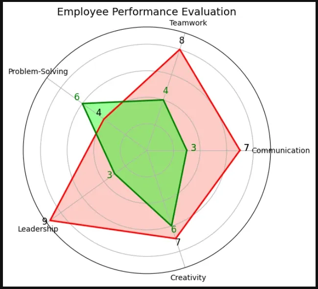
Example 2: Multiple plots with annotations
import numpy as np
import matplotlib.pyplot as plt

# Define categories and values
categories = ['Communication', 'Teamwork', 'Problem-Solving', 'Leadership', 'Creativity']
values = [7, 8, 4, 9, 7]  # Scores
new_values = [3, 4, 6, 3, 6]   # Scores

# Compute angles for each category
num_vars = len(categories)
angles = np.linspace(0, 2 * np.pi, num_vars, endpoint=False).tolist()

# Close the radar chart by repeating the first value and angle
values += values[:1]
new_values += new_values[:1]
angles += angles[:1]

# Create polar plot
fig, ax = plt.subplots(figsize=(6, 6), subplot_kw={'projection': 'polar'})

# Plot data and fill area
ax.fill(angles, values, color='salmon', alpha=0.4, label="Performance")
ax.plot(angles, values, color='red', linewidth=2)

ax.fill(angles, new_values, color='lime', alpha=0.4, label="Performance")
ax.plot(angles, new_values, color='green', linewidth=2)

# Add category labels
ax.set_xticks(angles[:-1])
ax.set_xticklabels(categories)

# Annotate each value directly on the chart
for angle, value in zip(angles, values):
    ax.text(angle, value + 0.5, f'{value}', ha='center', fontsize=12, color='black', fontweight='normal')

for angle, value in zip(angles, new_values):
    ax.text(angle, value + 0.5, f'{value}', ha='center', fontsize=12, color='green', fontweight='normal')


# Customize the chart
ax.set_yticklabels([])  # Remove y-axis labels for clarity
ax.set_title("Student Performance Evaluation", fontsize=14)

# Show plot
plt.show()
result:
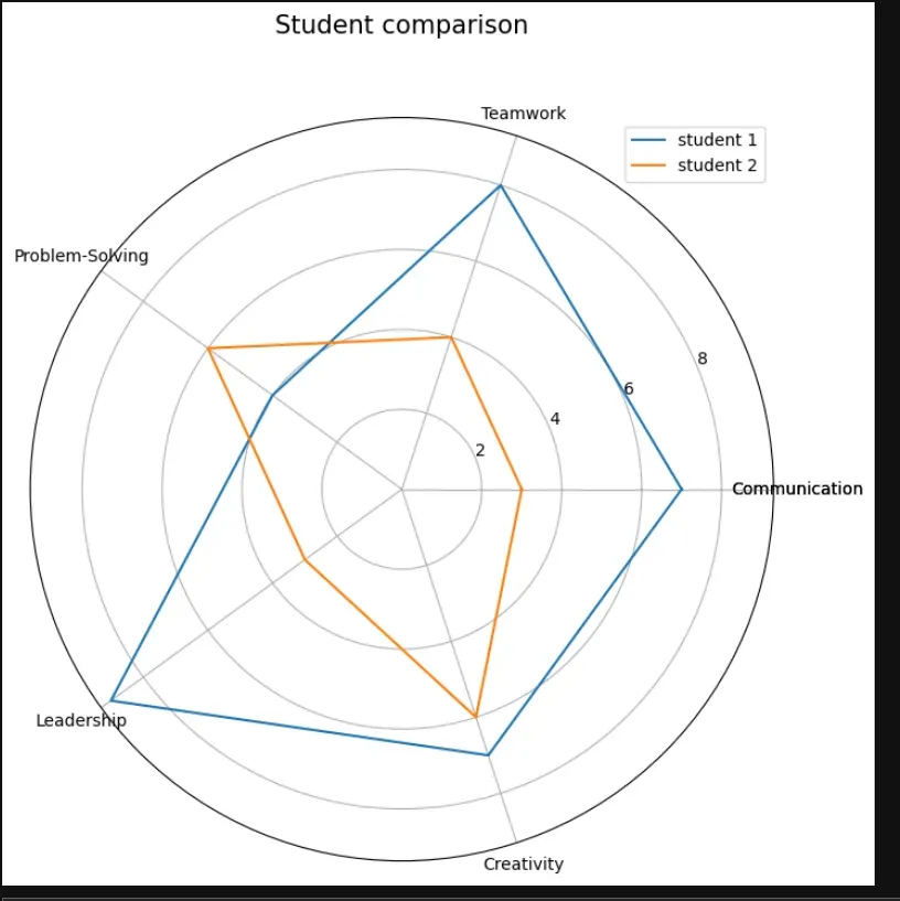
Example 3: Spider chart in Python
import numpy as np
import matplotlib.pyplot as plt


categories = ['Communication', 'Teamwork', 'Problem-Solving', 'Leadership', 'Creativity']
categories += categories[:1]

student1 = [7, 8, 4, 9, 7]
student2 = [3, 4, 6, 3, 6]
student1 += student1[:1]
student2 += student2[:1]

label_loc = np.linspace(start=0, stop=2 * np.pi, num=len(student1))

plt.figure(figsize=(8, 8))
plt.subplot(polar=True)
plt.plot(label_loc, student1, label='student 1')
plt.plot(label_loc, student2, label='student 2')

plt.title('Student comparison', size=15, y=1.10)
lines, labels = plt.thetagrids(np.degrees(label_loc), labels=categories)
plt.legend()
plt.show()
output: