To rotate the X-axis tick labels in a Pandas plot, you can use 3 different ways:
df.plot(kind='bar', rot=0)- pass the parameter to plot functions applied to DataFrameax.set_xticklabels(df['Month'], rotation=45)- by using additional method applied on plot objectplt.xticks(rotation=90)fig.autofmt_xdate()
In all of them we can pass the rotation parameter to specify the angle by which you want to rotate the X labels. Depending on your plot and needs you can use them
Below you can find two examples of the most used by me:
Steps to plot 2 variables
- Import matplotlib library
- Create sample DataFrame
- Create the axes object (optional)
ax = df.plot(x='Month', y='Sales', kind='bar')
- Rotate X-axis tick labels by 45 degrees
- Add labels and title (optional)
More information can be found: DataFrame.plot - secondary_y
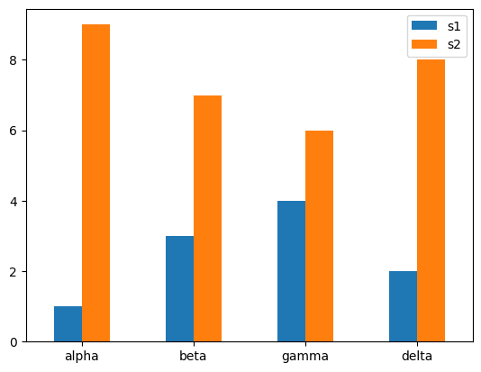
Data
| s1 | s2 | |
|---|---|---|
| variables | ||
| alpha | 1 | 9 |
| beta | 3 | 7 |
| gamma | 4 | 6 |
| delta | 2 | 8 |
Example 1 - rot=0
import matplotlib
import matplotlib.pyplot as plt
import pandas as pd
data = {'variables':["alpha","beta","gamma","delta"],
        's1':[1,3,4,2],
        's2':[9,7,6,8]}
df = pd.DataFrame(data)

df.set_index(["variables"],inplace=True)
df.plot(kind='bar', rot=0)
plt.xlabel("")
plt.show()
Output 1
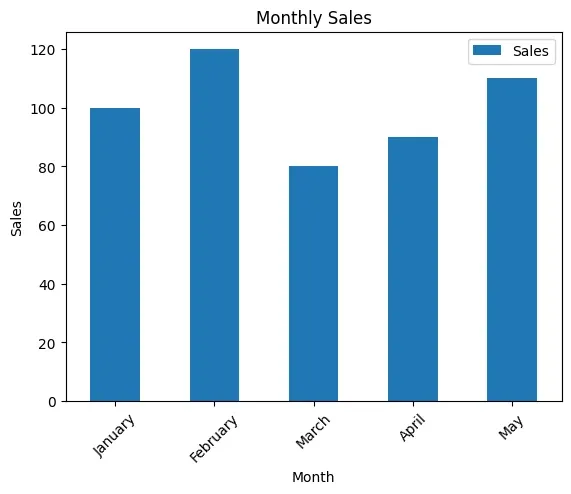
Example 2 - set_xticklabels
import pandas as pd
import matplotlib.pyplot as plt

# Sample data
data = {'Month': ['January', 'February', 'March', 'April', 'May'],
        'Sales': [100, 120, 80, 90, 110]}

df = pd.DataFrame(data)

# Create a plot
ax = df.plot(x='Month', y='Sales', kind='bar')

# Rotate X-axis tick labels by 45 degrees
ax.set_xticklabels(df['Month'], rotation=45)

# Add labels and title
plt.xlabel('Month')
plt.ylabel('Sales')
plt.title('Monthly Sales')

# Show the plot
plt.show()
Output 2