


When plotting a bar chart in Pandas, you can assign different colors to bars using the color parameter.
Data
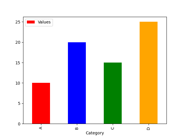
| Category | Values | |
|---|---|---|
| 0 | A | 10 |
| 1 | B | 20 |
| 2 | C | 15 |
| 3 | D | 25 |
1: Basic Bar Chart with Custom Colors
import pandas as pd
import matplotlib.pyplot as plt

# Sample data
data = {'Category': ['A', 'B', 'C', 'D'],
        'Values': [10, 20, 15, 25]}
df = pd.DataFrame(data)

# Plot with different colors
df.plot(kind='bar', x='Category', y='Values', color=['red', 'blue', 'green', 'orange'])

plt.show()
2: Assign Colors Dynamically Based on Values
colors = ['red' if v > 15 else 'blue' for v in df['Values']]
df.plot(kind='bar', x='Category', y='Values', color=colors)

plt.show()
3: Using Colormap for Gradient Colors
df.plot(kind='bar', x='Category', y='Values', colormap='viridis')
plt.show()
This approach makes your bar charts visually appealing and easy to interpret!