


The d3blocks library in Python makes it easy to create chord diagrams..
When to Use a Chord Diagram?
A chord diagram is useful for analyzing relationships between different entities. Some common applications include:
- Trade Relations: Visualizing imports and exports between countries
- Migration Patterns: Understanding population movement between regions
- Social Networks: Showing connections between people or organizations
- Traffic Flow: Representing transportation movements
Steps to Plot a Chord Diagram with d3blocks
- Install
d3blocksusing pippip install d3blocks
- Import
D3Blocksfrom the library - Prepare a DataFrame with:
- source
- target
- value
- Use the
d3.chord()function to generate the diagram - Save and view the HTML file in a browser
More information can be found: d3blocks GitHub Repository
Data
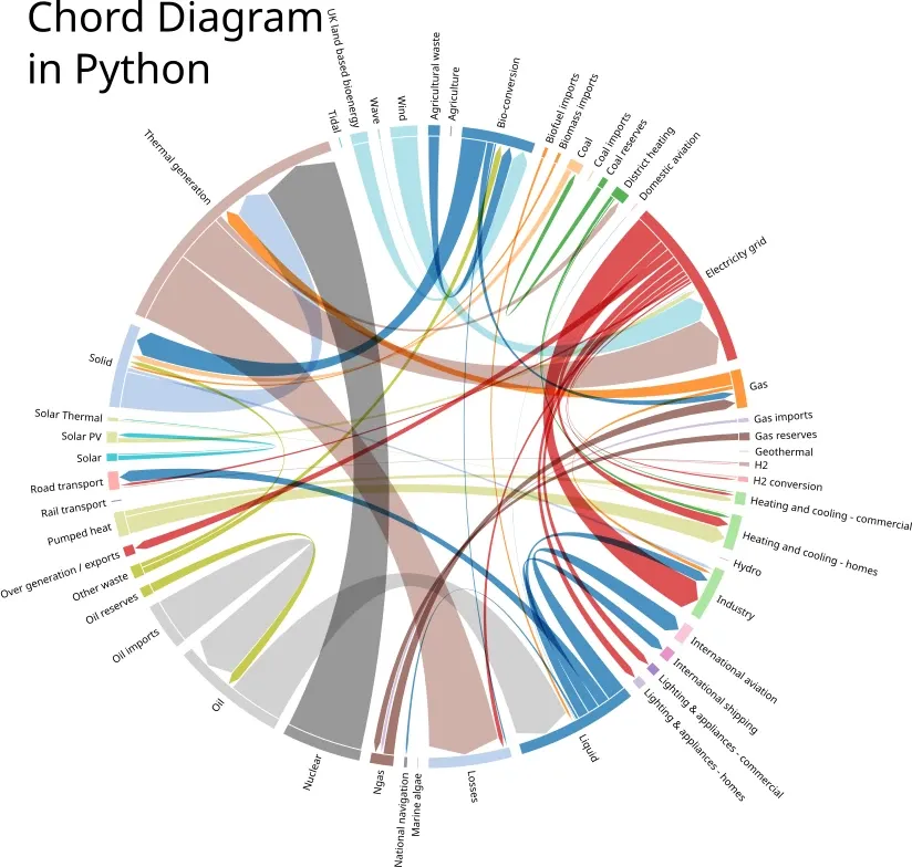
For this example we will load energy data from the package itself:
| source | target | weight | |
|---|---|---|---|
| 0 | Agricultural 'waste' | Bio-conversion | 124.729 |
| 1 | Bio-conversion | Liquid | 0.597 |
| 2 | Bio-conversion | Losses | 26.862 |
| 3 | Bio-conversion | Solid | 280.322 |
| 4 | Bio-conversion | Gas | 81.144 |
Example: Creating a Chord Diagram with d3blocks
import numpy as np
from d3blocks import D3Blocks

d3 = D3Blocks()

df = d3.import_example('energy')

d3.chord(df, ordering=np.sort(np.unique(df['source'].values)))

d3.chord(df, ordering='ascending')
Output
This will generate an Chord Diagram, which:
- Shows energy relationships between different sources
- Uses color-coded nodes and links
Customizing the Chord Diagram
The d3blocks library allows you to customize the diagram with options such as:
d3.chord(df, filepath="custom_chord.html", cmap="viridis", title="Global Trade Relations")
cmap="viridis"→ Changes the color maptitle="Global Trade Relations"→ Adds a title