To add title and axis labels in Matplotlib and Python we need to use plt.title() and plt.xlabel()
Steps
- Import libraries -
matplotliband `numpy - Prepare Data
- Select columns X and Y
- Select colors
- Select chart type
- Add title
- adjust title font size
- Add axis labels
- Show plot
More information can be found: Creating multiple subplots using
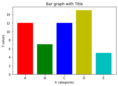
Data
| x | y | c | |
|---|---|---|---|
| 0 | 12 | A | r |
| 1 | 7 | B | g |
| 2 | 12 | C | b |
| 3 | 15 | D | y |
| 4 | 5 | E | c |
Example
To add title and axis labels we can do:
plt.title('Bar graph with Title')plt.xlabel('X categories')plt.ylabel('Y')
Full example:
import numpy as np
import matplotlib.pyplot as plt

x = df['x']
y = df['y']
c = df['c']
x_pos = np.arange(len(y))

plt.bar(x_pos, x, color = c)

plt.title('Bar graph with Title', fontsize=20)
plt.xlabel('X categories')
plt.ylabel('Y values')

plt.xticks(x_pos, y)

plt.show()
Output