


To plot heatmap(heat map) in Python we can use different libraries like:
- seaborn
- matplotlib
or combination or them.
Steps
- Import libraries - matplotlib, seaborn
- Select data to be plot
- create pivot table
- Plot the heat map
- select heat map type
- select color scheme
Note: If you like to plot Pandas DataFrame as a heatmap you can check:
How to Display Pandas DataFrame As a Heatmap
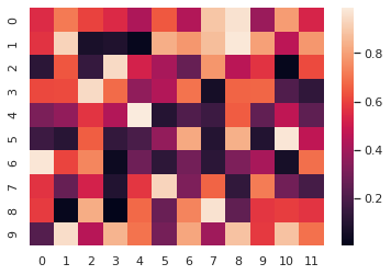
Example 1 - Heatmap
Data
Data will be created by np.random.rand(10, 12). It is arrays of random numbers:
array([[0.5488135 , 0.71518937, 0.60276338, 0.54488318, 0.4236548 ,
        0.64589411, 0.43758721, 0.891773  , 0.96366276, 0.38344152,
        0.79172504, 0.52889492],
       [0.56804456, 0.92559664, 0.07103606, 0.0871293 , 0.0202184 ,
        0.83261985, 0.77815675, 0.87001215, 0.97861834, 0.79915856,
        0.46147936, 0.78052918],
Code
So to plot multiple plots with matplotlib we need to provide the plt.figure()
import numpy as np; np.random.seed(0)
import matplotlib.pyplot as plt
import seaborn as sns; sns.set_theme()

uniform_data = np.random.rand(10, 12)

ax = sns.heatmap(uniform_data)
Output
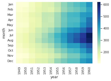
Example 2 - Python heatmap colors
Data
For this example we will use data coming with the seaborn library:
| year | 1949 | 1950 | 1951 | 1952 | 1953 | 1954 | 1955 | 1956 | 1957 | 1958 | 1959 | 1960 |
|---|---|---|---|---|---|---|---|---|---|---|---|---|
| month | ||||||||||||
| Jan | 112 | 115 | 145 | 171 | 196 | 204 | 242 | 284 | 315 | 340 | 360 | 417 |
| Feb | 118 | 126 | 150 | 180 | 196 | 188 | 233 | 277 | 301 | 318 | 342 | 391 |
| Mar | 132 | 141 | 178 | 193 | 236 | 235 | 267 | 317 | 356 | 362 | 406 | 419 |
| Apr | 129 | 135 | 163 | 181 | 235 | 227 | 269 | 313 | 348 | 348 | 396 | 461 |
| May | 121 | 125 | 172 | 183 | 229 | 234 | 270 | 318 | 355 | 363 | 420 | 472 |
Code
First we load the dataset and then do a pivot table on columns:
- month - index
- year - columns
- passengers - values
To change colors of heatmap in Python we can use parameter: cmap="YlGnBu"
flights = sns.load_dataset("flights")
flights = flights.pivot("month", "year", "passengers")
ax = sns.heatmap(flights, cmap="YlGnBu")
If you like to find more Python and matplotlib colors please check: Full List of Named Colors in Pandas and Python
Output
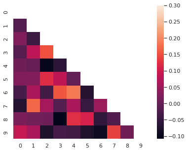
Example 3 - Correlogram
Data
Again we are using random numbers:
array([[ 1.        ,  0.08615821, -0.02380759,  0.01254937, -0.09259778,
        -0.06358862, -0.01470216, -0.07846244, -0.02754994,  0.00490301],
       [ 0.08615821,  1.        ,  0.18129382, -0.13650656,  0.05585866,
         0.02908082, -0.10838342,  0.04390444, -0.03423537,  0.02155898],
       [-0.02380759,  0.18129382,  1.        , -0.0554918 ,  0.01511297,
         0.09564635, -0.01457802,  0.02515053,  0.13420019, -0.1104883 ]])
Code
To plot correlogram in Python we will calculate the correlation coefficients by - np.corrcoef()
corr = np.corrcoef(np.random.randn(10, 200))
mask = np.zeros_like(corr)
mask[np.triu_indices_from(mask)] = True
with sns.axes_style("white"):
    f, ax = plt.subplots(figsize=(7, 5))
    ax = sns.heatmap(corr, mask=mask, vmax=.3, square=True)
Output
More examples can be found on the official page: seaborn.heatmap