


This article explores how to create Box and Whisker Plots using Seaborn and Matplotlib to visualize dataset distribution, spread, and outliers.
Why Use Box and Whisker Plots?
When dealing with statistical datasets, understanding the distribution and detecting outliers is essential. Using box plots helps:
- Visualize Data Distribution: Display how data is spread, showing the center, range, and overall distribution in a compact visual form
- Compare Multiple Groups: Efficiently compare different datasets side by side, such as student scores across classes or sales across regions
- Detect Outliers: Easily spot unusual or extreme values that lie far from the rest of the data
- Understand Skewness: Determine whether data is symmetric or skewed by observing the median position and whisker lengths
Components of a Box and Whisker Plot
A Box and Whisker Plot is made up of the following components:
- Box: Extends from the first quartile (Q1) to the third quartile (Q3), representing the middle 50% of the data, also known as the Interquartile Range (IQR)
- Whiskers: Extend from Q1 to the minimum value and from Q3 to the maximum value, showing the range of most of the data
- Median Line: A line inside the box represents the median (Q2), dividing the dataset into two equal halves
- Outliers: Data points that lie beyond the whiskers are treated as outliers and are usually shown as individual points
More information can be found: Matplotlib Boxplot Documentation
Steps to Create a Box and Whisker Plot
- Import required libraries (matplotlib, seaborn, pandas)
- Load or create your dataset
- Extract the relevant feature columns
- Create a box plot using
sns.boxplot()orplt.boxplot() - Customize colors, labels, and outlier markers
Dataset: Student Test Scores
The dataset contains test scores of a group of students with the following values:
Data (test scores): 78, 85, 90, 92, 95, 96, 97, 98, 99, 100, 105, 110, 120
The five-number summary for this dataset is: 78, 91, 97, 102.5, 120
import pandas as pd
data = pd.DataFrame({
    "scores": [78, 85, 90, 92, 95, 96, 97, 98, 99, 100, 105, 110, 120]
})
print("Shape of input data: "+str(data.shape))
data.head()
Example: Plot Box and Whisker Plot for Test Scores
import matplotlib.pyplot as plt
import seaborn as sns
%matplotlib inline

plt.figure(figsize=(8, 6))
sns.boxplot(y=data["scores"], color="skyblue", width=0.4)
plt.title("Box and Whisker Plot: Student Test Scores")
plt.ylabel("Scores")
plt.grid(axis="y", linestyle="--", alpha=0.7)
plt.show()
Output
- A vertical box plot is displayed for the
scoresfeature - The box represents the Interquartile Range (IQR) from Q1 (91) to Q3 (102.5)
- The median line (Q2 = 97) is drawn inside the box
- Whiskers extend from the minimum (78) to Q1 and from Q3 to the maximum (120)
- No outliers are detected in this dataset
Example: Comparing Multiple Groups
import matplotlib.pyplot as plt
import seaborn as sns
import pandas as pd
%matplotlib inline

data = pd.DataFrame({
    "scores": [78, 85, 90, 92, 95, 96, 97, 98, 99, 100, 105, 110, 120,
               65, 70, 72, 75, 80, 82, 85, 88, 90, 92, 95, 98, 100,
               88, 90, 92, 94, 96, 98, 100, 102, 104, 106, 108, 110, 112],
    "class": ["A"]*13 + ["B"]*13 + ["C"]*13
})

plt.figure(figsize=(10, 6))
sns.boxplot(x="class", y="scores", data=data, palette="Set2")
plt.title("Box Plot Comparison: Scores Across Classes")
plt.xlabel("Class")
plt.ylabel("Scores")
plt.show()
Output
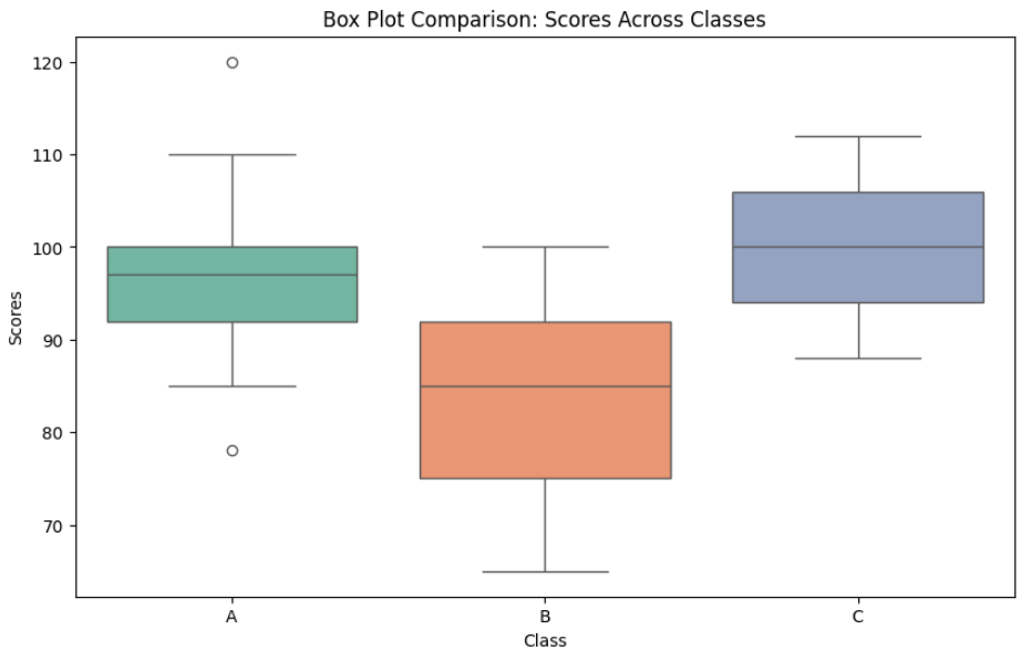
- Three box plots are displayed side by side for Class A, B, and C
- Each box shows the median, quartiles, and whiskers for its group
- Comparing boxes makes it easy to spot differences in central tendency and spread
- Outliers (if any) appear as individual points beyond the whiskers
Customizations
- Adjust
width=0.4insns.boxplot()to change box thickness - Use
palette="Set2"for different color schemes - Add
notch=Truefor notched box plots to compare medians visually - Modify
figsize=(10, 6)to increase/decrease plot size - Use
hue="class"for grouped box plots with additional categories
sns.boxplot(x="class", y="scores", data=data, palette="Set2",
            width=0.5, notch=True, hue="class", legend=False)
Uses of Box and Whisker Plot
- Visualizing Data Distribution: Box plots provide a clear picture of how data is spread, showing the center, range, and overall distribution in a compact visual form
- Comparing Multiple Groups: They are useful for comparing different datasets side by side, such as student scores across classes or sales across regions
- Detecting Outliers: Box plots make it easy to spot unusual or extreme values that lie far from the rest of the data
- Understanding Skewness: By observing the position of the median and the length of whiskers, one can determine whether data is symmetric or skewed
- Supporting Statistical Analysis: They provide a quick summary of key statistics, helping analysts decide which statistical methods or tests to apply
- Quality Control and Monitoring: In manufacturing and business processes, box plots help track variations and identify when results fall outside acceptable limits
Box and Whisker Diagram
   Box and Whisker Plot: Student Test Scores
   ─────────────────────────────────────────

   Scores
     │
 120 ┤ ────────  ●  ← Maximum (top of upper whisker)
     │           │
 110 ┤           │
     │           │
 105 ┤           │
     │           │
     │      ┌────┴────┐  ← Q3 (102.5)
 100 ┤      │         │
     │      │         │
     │      │─────────│  ← Median / Q2 (97)
  97 ┤      │         │
     │      │         │
     │      └────┬────┘  ← Q1 (91)
  90 ┤           │
     │           │
  85 ┤           │
     │           │
  78 ┤ ────────  ●  ← Minimum (bottom of lower whisker)
     │
     └──────────────────────────────
              Test Scores
What the Rendered Plot Shows
| Element | Value | Meaning |
|---|---|---|
| Lower Whisker | 78 | Minimum value |
| Q1 (Bottom of Box) | 91 | 25th percentile |
| Median (Line in Box) | 97 | 50th percentile |
| Q3 (Top of Box) | 102.5 | 75th percentile |
| Upper Whisker | 120 | Maximum value |
| Outliers | None | No points beyond whiskers |
Install Requirements (if needed)
pip install matplotlib seaborn pandas
If you'd like, I can also provide a side-by-side comparison plot (Class A vs B vs C) as runnable code — just let me know.
