


This article shows how to create a bubble plot with an encircling boundary using Matplotlib and SciPy's ConvexHull, so you can visually emphasize a group of important points within the scatter plot.
Why Encircle Points on a Bubble Plot?
Sometimes you want to show a group of points within a boundary to emphasize their importance. Drawing a convex hull around a subset of the data helps:
- Highlight a specific group (e.g., one state or category) among many points
- Make the plot more readable by separating regions visually
- Draw attention to outliers or clusters worth investigating
Steps to Create a Bubble Plot with Encircling
- Import required libraries (
matplotlib,seaborn,pandas,numpy,scipy) - Load the midwest dataset - source: midwest_filter.csv
- Assign a unique color per category using the
tab10colormap - Draw a bubble scatter plot where marker size comes from a
dot_sizecolumn - Define the
encircle()function using ConvexHull to compute the boundary vertices - Filter the records to be encircled and pass them to
encircle()
Dataset: Midwest Demographics
The dataset contains U.S. Midwest counties with columns for county area, total poptotal, a category, and a precomputed dot_size for bubble markers. The state column lets us select a subset (here, Indiana) to encircle.
source: midwest_filter.csv
import pandas as pd
midwest = pd.read_csv("https://raw.githubusercontent.com/selva86/datasets/master/midwest_filter.csv")
print("Shape of input data: " + str(midwest.shape))
midwest.head()
Example: Bubble Plot with Encircling
from matplotlib import patches
from scipy.spatial import ConvexHull
import warnings; warnings.simplefilter('ignore')
sns.set_style("white")

# Step 1: Prepare Data
midwest = pd.read_csv("https://raw.githubusercontent.com/selva86/datasets/master/midwest_filter.csv")

# As many colors as there are unique midwest['category']
categories = np.unique(midwest['category'])
colors = [plt.cm.tab10(i/float(len(categories)-1)) for i in range(len(categories))]

# Step 2: Draw Scatterplot with unique color for each category
fig = plt.figure(figsize=(16, 10), dpi=80, facecolor='w', edgecolor='k')

for i, category in enumerate(categories):
    plt.scatter('area', 'poptotal', data=midwest.loc[midwest.category==category, :],
                s='dot_size', c=colors[i], label=str(category),
                edgecolors='black', linewidths=.5)

# Step 3: Encircling
# https://stackoverflow.com/questions/44575681/how-do-i-encircle-different-data-sets-in-scatter-plot
def encircle(x, y, ax=None, **kw):
    if not ax: ax = plt.gca()
    p = np.c_[x, y]
    hull = ConvexHull(p)
    poly = plt.Polygon(p[hull.vertices, :], **kw)
    ax.add_patch(poly)

# Select data to be encircled
midwest_encircle_data = midwest.loc[midwest.state == 'IN', :]

# Draw polygon surrounding vertices
encircle(midwest_encircle_data.area, midwest_encircle_data.poptotal, ec="k", fc="gold", alpha=0.1)
encircle(midwest_encircle_data.area, midwest_encircle_data.poptotal, ec="firebrick", fc="none", linewidth=1.5)

# Step 4: Decorations
plt.gca().set(xlim=(0.0, 0.1), ylim=(0, 90000),
              xlabel='Area', ylabel='Population')
plt.xticks(fontsize=12); plt.yticks(fontsize=12)
plt.title("Bubble Plot with Encircling", fontsize=22)
plt.legend(fontsize=12)
plt.show()
Output
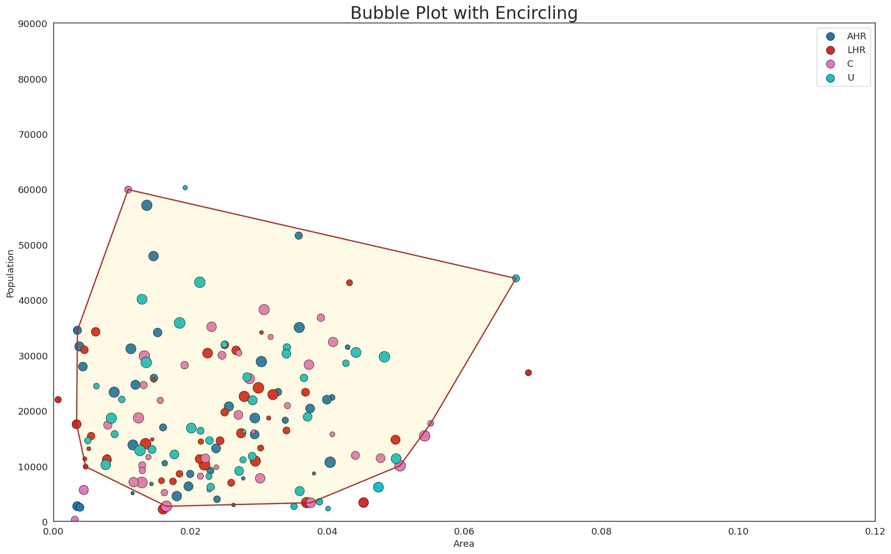
- Bubble points are drawn for each category with unique colors from
tab10. - Marker size varies by the
dot_sizecolumn, giving the bubble effect. - All Indiana (IN) counties are encircled with a gold-filled convex hull plus a firebrick outline, making the group stand out from the rest.
Customizations
- Change
fc="gold", alpha=0.1to a different fill color or transparency for the enclosed region - Remove
fc="none"in the secondencircle()call to add a solid boundary instead of an outline - Call
encircle()multiple times to highlight several groups in different colors - Adjust
xlim/ylimto zoom into a specific region of the plot
Resources
- SciPy ConvexHull
- Matplotlib Scatter
- Seaborn Set Style
- Pandas Read CSV
Frequently Asked Questions
How do I encircle points in a Matplotlib scatter plot?
Compute the convex hull of the points you want to highlight with scipy.spatial.ConvexHull, then add a matplotlib.patches.Polygon built from the hull vertices to the axes.
What is a convex hull?
The convex hull is the smallest convex polygon that contains all the selected points — like stretching a rubber band around the outermost points.
Can I encircle multiple groups in one plot?
Yes. Call the encircle() function once per subset with different fc (fill color) and ec (edge color) arguments.
Why is my encircle() call failing?
ConvexHull requires at least 3 non-collinear points. Make sure the filtered subset contains enough points and that they are not all in a straight line.
