


In this short article, you can find how to customize pandas pie plot with labels and legend.
1. Steps to customize pie plot
- Import necessary libraries:
import pandas as pdandimport matplotlib.pyplot as plt. - Prepare your data in a pandas DataFrame.
- Plot the pie chart using
df.plot(kind='pie', ...). - Customize labels, explode, and other parameters as needed.
- Add a legend using
plt.legend()and display the plot withplt.show().
2. Data
Consider a dataset with cities and their corresponding values as:
import pandas as pd
import numpy as np

data = {
	'Metropolis': ['New York', 'London', 'Paris', 'Tokyo', 'Sydney', 'Berlin', 'Rome', 'Moscow', 'Toronto'],
	'Risk Level': ['Low', 'High', 'Medium', 'Low', 'Low', 'Medium', 'Low', 'Medium', 'Medium']
}

df = pd.DataFrame(data)
data looks like:
| Metropolis | Risk Level | |
|---|---|---|
| 0 | New York | Low |
| 1 | London | High |
| 2 | Paris | Medium |
| 3 | Tokyo | Low |
| 4 | Sydney | Low |
| 5 | Berlin | Medium |
| 6 | Rome | Low |
| 7 | Moscow | Medium |
| 8 | Toronto | Medium |
3. Example
We are going to show the pie plot customization in 3 consecutive steps in order to illustrate the customization better.
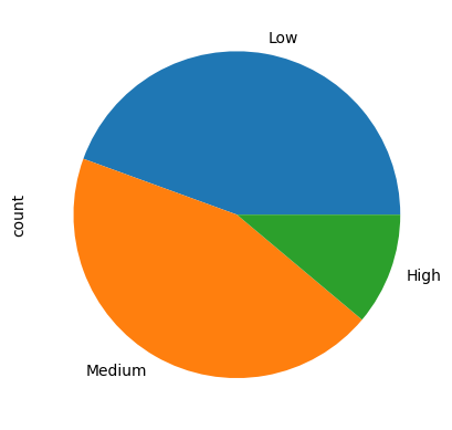
Default pie plot
Let's see the default behavior of Pandas pie plot:
df["Risk Level"].value_counts().plot(kind="pie");
which will produce:
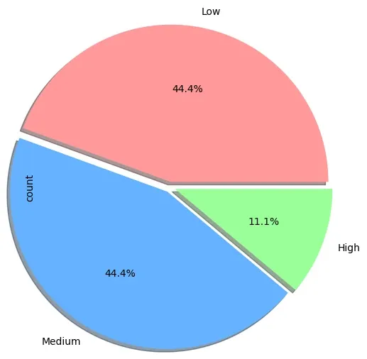
Customize the colors and labels
In this step we will customize the colors and the labels of the default pie chart by:
colors = ['#ff9999','#66b3ff','#99ff99','#ffcc99']
expl = [0.05] * 3
data = df["Risk Level"].value_counts().plot(kind="pie",autopct='%1.1f%%', radius=1.5, shadow=True, explode=expl, colors=colors)
which will give us:
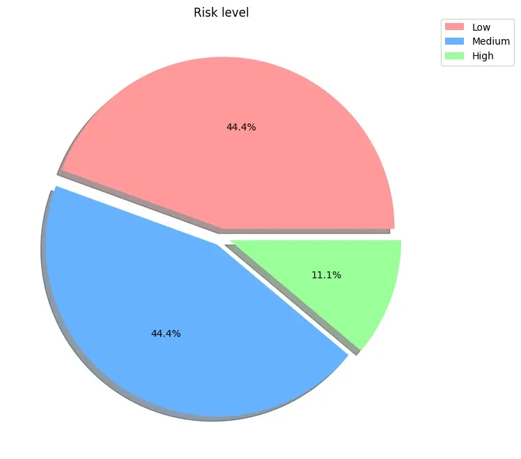
Customize the title, legend and axis
Finally we will see how to customize legend, axis and the title of the pie chart in order to achieve:
colors = ['#ff9999','#66b3ff','#99ff99','#ffcc99']
data = df["Risk Level"].value_counts()
ax = data.plot(kind="pie", autopct='%1.1f%%', shadow=True, explode=[0.05, 0.05, 0.05], colors=colors, legend=True, title='Risk Level', ylabel='', labeldistance=None)
ax.legend(bbox_to_anchor=(1, 1.02), loc='upper left')
plt.show()
which give us the final:
Code Explanation
You can find the code explanation below:
- Define a list of colors for the pie chart slices.
- Calculate the counts of the "Risk Level" column
- Plot a pie chart of the data with the following settings:
kind="pie"-Chart type: pie chartautopct='%1.1f%%'- Display percentages with one decimal point.shadow=True- Add shadow effect to the chart.explode=[0.05, 0.05, 0.05]- Explode the slices slightly for emphasis. Number of explodes should match the slices to avoid errorValueError: 'explode' must be of length 'x'. You can change the values to emphasize some slices- Apply the predefined colors for the slices.
- Show the
- legend -
legend=True - title -
title='Risk Level' - remove ylabel -
ylabel=''
- legend -
- Set label distance to None to remove labels -
labeldistance=None
- Adjust legend position to be outside the pie chart.
- Display the pie chart.