To make a double bar plot or plot bar graph with two y axis in Pandas you can:
- use
secondary_y-secondary_y= 'amount' - use subplots
Steps to plot bar chart with 2 Y-axis
- Import matplotlib library
- Create DataFrame with correlated data
- Create the bar plot and axes objects
- Plot the first variable on x and left y axes
- Plot the second variable on x and secondary y axes
More information can be found: DataFrame.plot - secondary_y
Data
| amount | price | |
|---|---|---|
| A | 4 | 400 |
| B | 8 | 500 |
| C | 15 | 1000 |
| D | 7 | 600 |
| E | 3 | 120 |
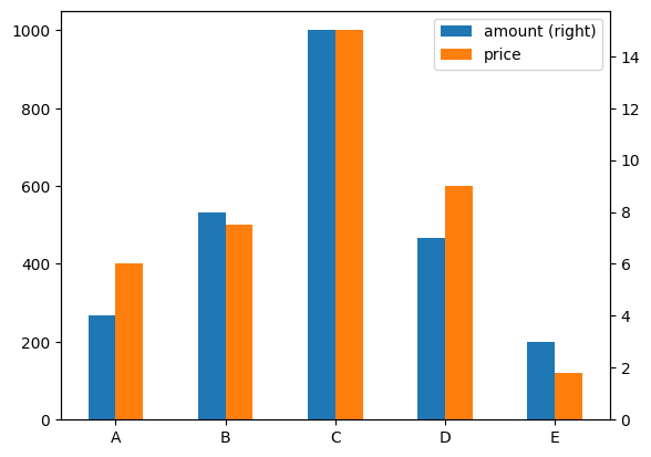
Example 1 - secondary_y
import matplotlib.pyplot as plt
import pandas as pd

data = {"amount":{"A":4,"B":8,"C":15,"D":7,"E":3},
        "price":{"A":400,"B":500,"C":1000,"D":600,"E":120}}
df = pd.DataFrame(data)

_ = df.plot( kind= 'bar' , secondary_y= 'amount' , rot= 0 )
plt.show()
Output
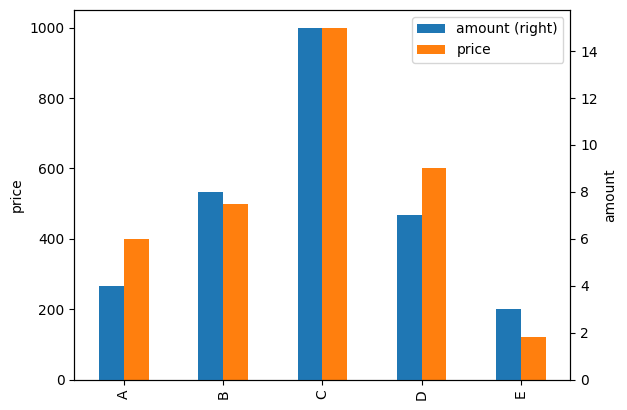
Example 2 - secondary_y - add axis names
Create a figure and two axes:
import matplotlib.pyplot as plt
import pandas as pd

data = {"amount":{"A":4,"B":8,"C":15,"D":7,"E":3},
        "price":{"A":400,"B":500,"C":1000,"D":600,"E":120}}
df = pd.DataFrame(data)

df.plot.bar(secondary_y= 'amount')

ax1, ax2 = plt.gcf().get_axes()
ax1.set_ylabel('price')

ax2.set_ylabel('amount')
Output
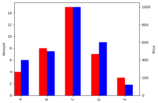
Example 3
import matplotlib.pyplot as plt
import pandas as pd

data = {"amount":{"A":4,"B":8,"C":15,"D":7,"E":3},
        "price":{"A":400,"B":500,"C":1000,"D":600,"E":120}}
df = pd.DataFrame(data)


fig = plt.figure()

ax = fig.add_subplot(111)
ax2 = ax.twinx()

width = 0.3

df.amount.plot(kind='bar', color='red', ax=ax, width=width, position=1)
df.price.plot(kind='bar', color='blue', ax=ax2, width=width, position=0)

ax.set_ylabel('Amount')
ax2.set_ylabel('Price')

plt.show()
Output