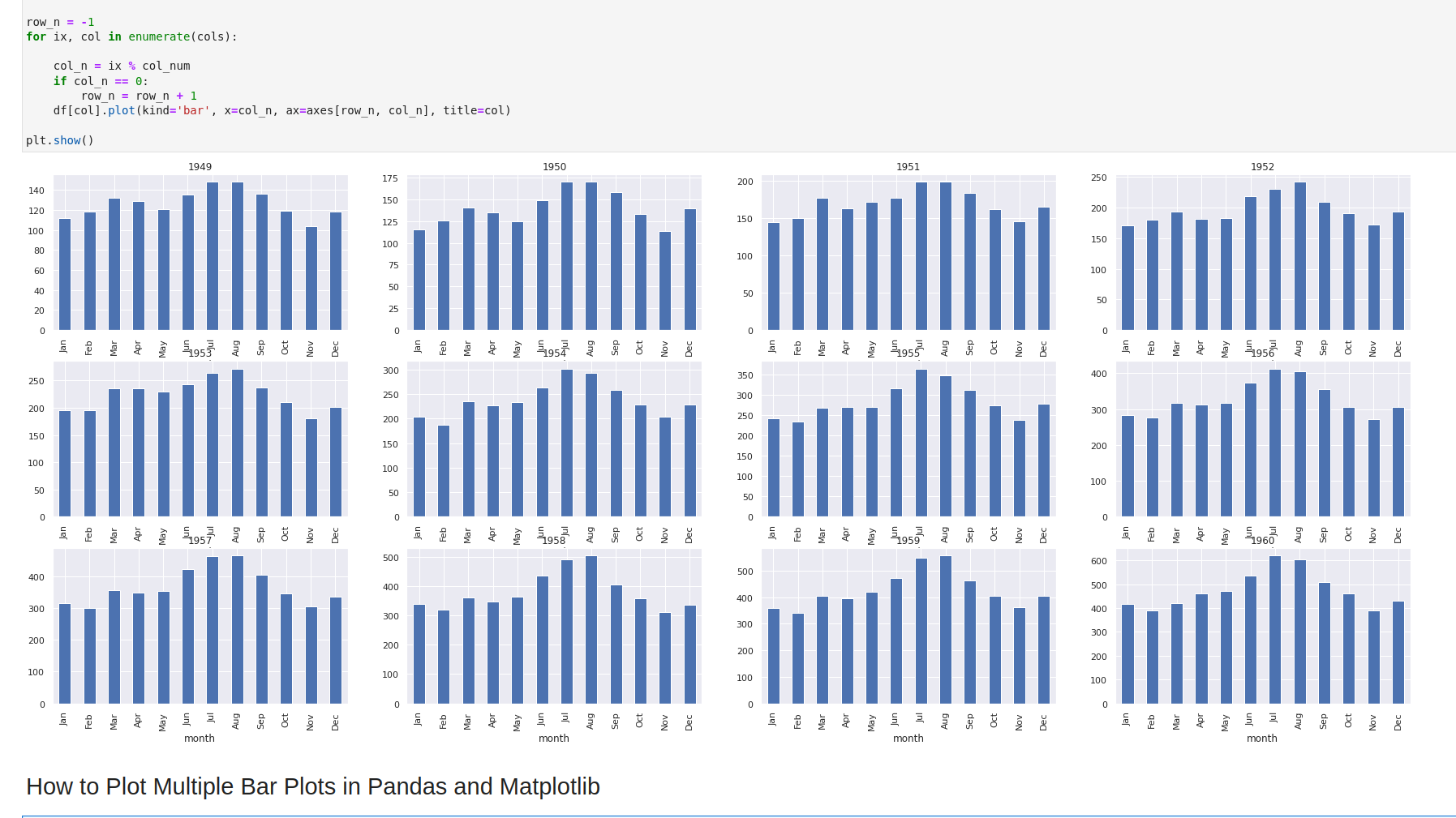
To plot multiple bar or line plots in Pandas and Matplotlib we can use plt.subplots()
Steps
- Import libraries
- Load and prepare data
- Select number of rows/columns for subplots
- row_num = 3; col_num = 4
- Create subplots
- select chart size
- set subplot position by -
fig, axes = plt.subplots(row_num, col_num)
- Plot subplots
- select chart type
- bar
- line chart
- scatter plot
- Add title
- select chart type
- Show plot
Data
We are loading the seaborn dataset for flights. Additionally we are mapping the month to season in order to get categorical data.
| year | 1949 | 1950 | 1951 | 1952 | 1953 | 1954 | 1955 | 1956 | 1957 | 1958 | 1959 | 1960 |
|---|---|---|---|---|---|---|---|---|---|---|---|---|
| month | ||||||||||||
| Jan | 112 | 115 | 145 | 171 | 196 | 204 | 242 | 284 | 315 | 340 | 360 | 417 |
| Feb | 118 | 126 | 150 | 180 | 196 | 188 | 233 | 277 | 301 | 318 | 342 | 391 |
| Mar | 132 | 141 | 178 | 193 | 236 | 235 | 267 | 317 | 356 | 362 | 406 | 419 |
| Apr | 129 | 135 | 163 | 181 | 235 | 227 | 269 | 313 | 348 | 348 | 396 | 461 |
| May | 121 | 125 | 172 | 183 | 229 | 234 | 270 | 318 | 355 | 363 | 420 | 472 |
Example
To plot scatter plot with best fit line we use:
sns.lmplot()- provide X and T
plt.ylabel('Y')
Full example:
import matplotlib.pyplot as plt
import seaborn as sns; sns.set_theme()

flights = sns.load_dataset("flights")
flights = flights.pivot(index="month", columns="year", values="passengers")

df = flights

cols = df.columns
row_num = 3
col_num = 4

fig, axes = plt.subplots(row_num, col_num, squeeze=False, figsize=(20,10))

row_n = -1
for ix, col in enumerate(cols):

    col_n = ix % col_num
    if col_n == 0:
        row_n = row_n + 1
    df[col].plot(kind='bar', x=col_n, ax=axes[row_n, col_n], title=col)

plt.show()
Note: for plotting multiple plots on single row we can use:
cols = df.columns

fig, axes = plt.subplots(1, len(cols), figsize=(30,5), squeeze=False)

for i, col in enumerate(cols):
    df[col].plot(kind='bar', x=col, ax=axes[0, i], title=col)

plt.show()
Output

TypeError: DataFrame.pivot() takes 1 positional argument but 4 were given
If you face error:
TypeError: DataFrame.pivot() takes 1 positional argument but 4 were given
the problem is changes the in the syntax for the pivot method:
from:
flights = flights.pivot("month", "year", "passengers")
to:
flights = flights.pivot(index="month", columns="year", values="passengers")
For more info you can check:
TypeError: DataFrame.pivot() takes 1 positional argument but 4 were given - Pandas
More information on multiple plots can be found here: Creating multiple subplots using


