


In this tutorial you can find how to plot Scatterplot in Python.
A Scatterplot is a commonly used plot to show relation between two and more numeric values. The data points are represented by dots.
Data used in this examples:
| country | GDP | happyScore | region | avg_income |
|---|---|---|---|---|
| Armenia | 0.76821 | 4.350 | 'Central and Eastern Europe' | 2096.76 |
| Angola | 0.75778 | 4.033 | 'Sub-Saharan Africa' | 1448.88 |
| Argentina | 1.05351 | 6.574 | 'Latin America and Caribbean' | 7101.12 |
| Austria | 1.33723 | 7.200 | 'Western Europe' | 19457.04 |
| Australia | 1.33358 | 7.284 | 'Australia and New Zealand' | 19917.00 |
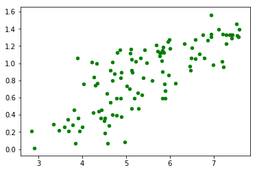
Basic Example: Scatterplot in Python
Below you can find a very basic example of Scatterplot in Python with matplotlib.
We are going to use method plt.scatter which takes several parameters like:
-
x, y : array_like, shape (n, ) - the numeric values which will be plot
-
data - the data which is going to be used
-
s : scalar or array_like, shape (n, ) - The dot size in points (optional)
-
c : color, sequence, or sequence of color (optional)
import pandas as pd
import numpy as np
import matplotlib as mpl
import matplotlib.pyplot as plt

# import dataset
df = pd.read_csv("../../data/happyscore_income.csv")

# plot scatter
plt.scatter('happyScore', 'GDP', data=df, s=20, color='green')
result:
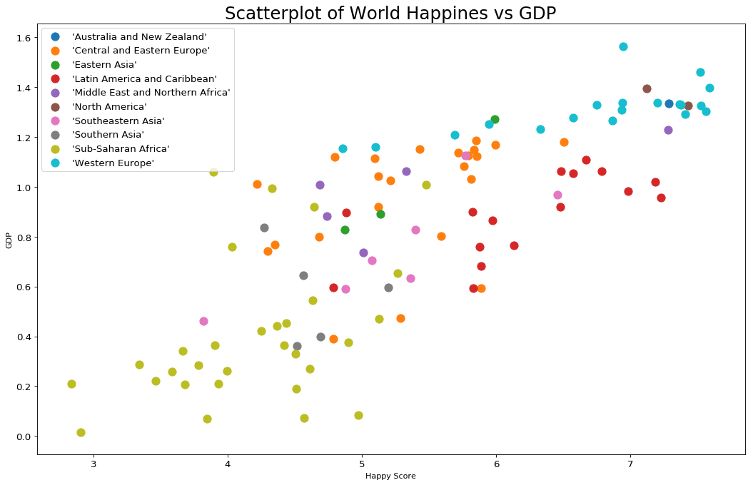
Scatterplot with title, named labels and different colors
In this section you can find an example of Scatterplot with title, named labels and different colors.
This time we will explain the code step by step. First we will start with the imports and the columns which will be used as numeric variables:
import pandas as pd
import numpy as np
import matplotlib as mpl
import matplotlib.pyplot as plt

# import dataset
df = pd.read_csv("../../data/happyscore_income.csv")

col_x = 'happyScore'
col_y = 'GDP'
col_group = 'region'
If you need you can convert your data to numeric:
df[col_x] = df[col_x].astype('float')
df[col_y] = df[col_y].astype('float')
If you like to display different categories or regions in different colours you can create list of colors per region by:
regions = np.unique(df[col_group])
colors = [plt.cm.tab10(i/float(len(regions)-1)) for i in range(len(regions))]
Finally we are going to plot each region in a different plot. We will add title, legend and labels:
# plot for each category
plt.figure(figsize=(16, 10), dpi= 80, facecolor='w', edgecolor='k')

for i, region in enumerate(regions):
    plt.scatter(col_x, col_y,
                data=df.loc[df[col_group] == region, :],
                s=100, color=colors[i], label=str(region))

# set x and y labels
plt.gca().set(xlabel='Happy Score', ylabel='GDP')

#set title and font size
plt.xticks(fontsize=12); plt.yticks(fontsize=12)
plt.title("Scatterplot of World Happiness vs GDP", fontsize=22)
plt.legend(fontsize=12)
plt.show()
Scatterplot with 3 numeric variables
Sometimes you will need to use 3 variables with Scatterplot. This is possible if you change the dot size in the Scatterplot.
Let's demonstrate this with the same example:
# Draw Plot for Each Category
plt.figure(figsize=(16, 10), dpi= 80, facecolor='w', edgecolor='k')

for i, region in enumerate(regions):
    plt.scatter('happyScore', 'GDP',
                data=df.loc[df.region==region, :],
                s=df.loc[df.region==region, :].avg_income.values / 10, color=colors[i], label=str(region))


# Decorations
plt.gca().set(xlim=(min_h, max_h ), ylim=(min_g, max_g),
              xlabel='Happy Score', ylabel='GDP')

plt.xticks(fontsize=12); plt.yticks(fontsize=12)
plt.title("Scatterplot of World Happiness vs GDP", fontsize=22)
plt.legend(fontsize=12)
plt.show()
result:
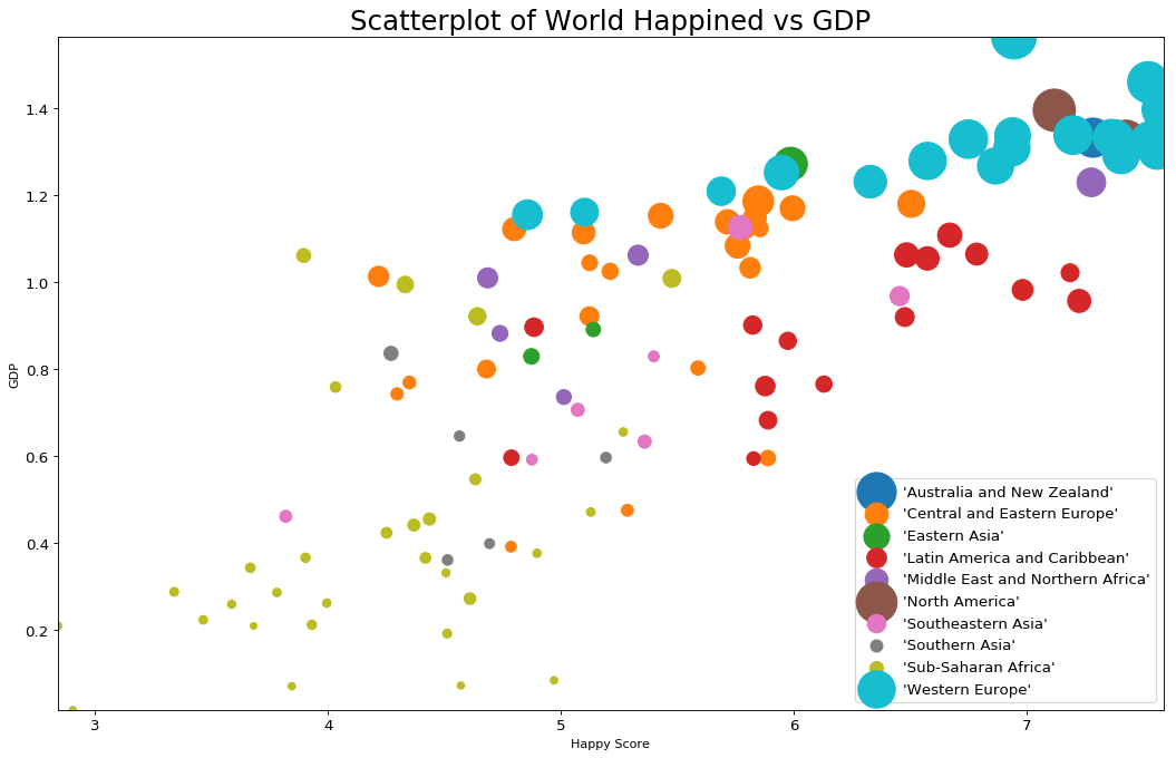
Explanation: Scatterplot
There are two axis in Scatterplot:
- x - in the example above it represents happyScore
- y - it represents the GDP
- s - dot size - optionally you can change the dot size depending on the 3 variable
What we can read from the last Scatterplot is that:
- In regions like: Australia and New Zealand, Western Europe, North America - people take the highest incomes, have higher GDP and are happier
- People in Sub-Saharan Africa have the lowest incomes and GDP. They have lower happiness score too
Tips and Errors: Scatterplot
- Use appropriate x-axis and y-axis scale
- Add labels, title and legend
- Transparency with alpha will make the scatterplot with thousands of points more readable
- Use trend lines to display trends
- Use different colors and decoration