To remove Xticks from a plot in Pandas or Matplotlib we have multiple options.
Remove Xticks in Matplotlib
-
turn off all axis
plt.axis('off')
-
remove with tick_params
plt.tick_params(\
    axis='x',          # changes apply to the x-axis
    which='both',      # both major and minor ticks are affected
    bottom='off',      # ticks along the bottom edge are off
    top='off',         # ticks along the top edge are off
    labelbottom='off') # labels along the bottom edge are off
- set empty ticks
plt.xticks([], [])
ax.set_xticks([])
ax.set_xticks([], minor=True)
Steps to plot 2 variables
- Import libraries pandas and matplotlib
- Create a sample DataFrame
- Create a bar plot
- Remove Xticks
- Set axis labels
- Show the plot
More information can be found: DataFrame.plot - secondary_y
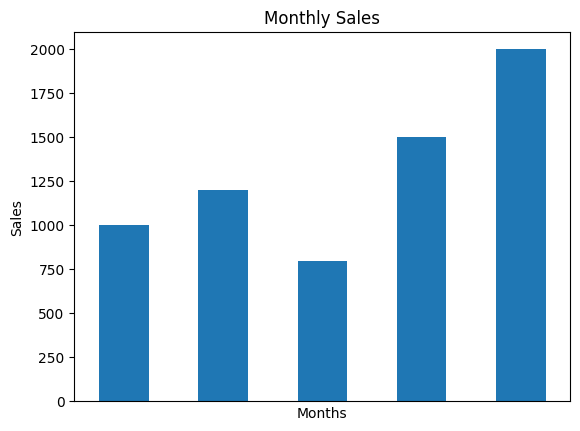
Data
| Months | Sales | |
|---|---|---|
| 0 | Jan | 1000 |
| 1 | Feb | 1200 |
| 2 | Mar | 800 |
| 3 | Apr | 1500 |
| 4 | May | 2000 |
Example
import pandas as pd
import matplotlib.pyplot as plt

# Create a sample DataFrame
data = {'Months': ['Jan', 'Feb', 'Mar', 'Apr', 'May'],
        'Sales': [1000, 1200, 800, 1500, 2000]}
df = pd.DataFrame(data)

# Create a bar plot
ax = df.plot(x='Months', y='Sales', kind='bar', legend=False)

# Remove Xticks
ax.set_xticks([])

# Set axis labels
plt.xlabel('Months')
plt.ylabel('Sales')

# Set the plot title
plt.title('Monthly Sales')

# Show the plot
plt.show()
Output