In this post you can find how to change the date formatting of x-axis labels in Matplotlib and Python.
Below you can find a simple example which will demonstrate how to edit the:
- date format
- label angle
So default behaviour of the Matplotlib and bar plot depends on the data that you have.
In this example we will use data for Bitcoin price from it's start. You can find the data below:
| Symbol | Date | High | Low | Open |
|---|---|---|---|---|
| BTC | 2013-04-29 23:59:59 | 147.488007 | 134.000000 | 134.444000 |
| BTC | 2013-04-30 23:59:59 | 146.929993 | 134.050003 | 144.000000 |
| BTC | 2013-05-01 23:59:59 | 139.889999 | 107.720001 | 139.000000 |
| BTC | 2013-05-02 23:59:59 | 125.599998 | 92.281898 | 116.379997 |
| BTC | 2013-05-03 23:59:59 | 108.127998 | 79.099998 | 106.250000 |
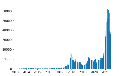
We can plot the price for each date with bar plot by method: plt.bar:
import pandas as pd
import matplotlib.pyplot as plt
import matplotlib.dates as mdates

df = pd.read_csv('../../data/coin_Bitcoin.csv')

df['Date'] = pd.to_datetime(df['Date'])

plt.bar(df['Date'], df['High'])
result:
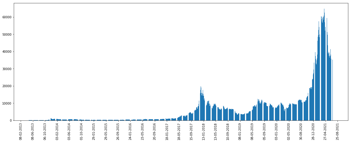
If you like to get a bigger plot and different x axis labels you can use the code below:
plt.figure(figsize=(20,8))
plt.gca().xaxis.set_major_formatter(mdates.DateFormatter('%d-%m-%Y'))

plt.bar(df['Date'], df['High'])
this will render the dates in the form of %d-%m-%Y instead of dates.
If you like to change the date frequency, the label angle of the bar plot you can use the import matplotlib.dates as mdates and set optimal interval by:
plt.gca().xaxis.set_major_locator(mdates.DayLocator(interval=120))
Full code:
plt.figure(figsize=(20,8))
plt.gca().xaxis.set_major_formatter(mdates.DateFormatter('%d-%m-%Y'))
plt.gca().xaxis.set_major_locator(mdates.DayLocator())

plt.gca().xaxis.set_major_locator(mdates.DayLocator(interval=120))
plt.gcf().autofmt_xdate()

plt.bar(df['Date'], df['High'])

plt.xticks(rotation=90)

plt.show()
result: