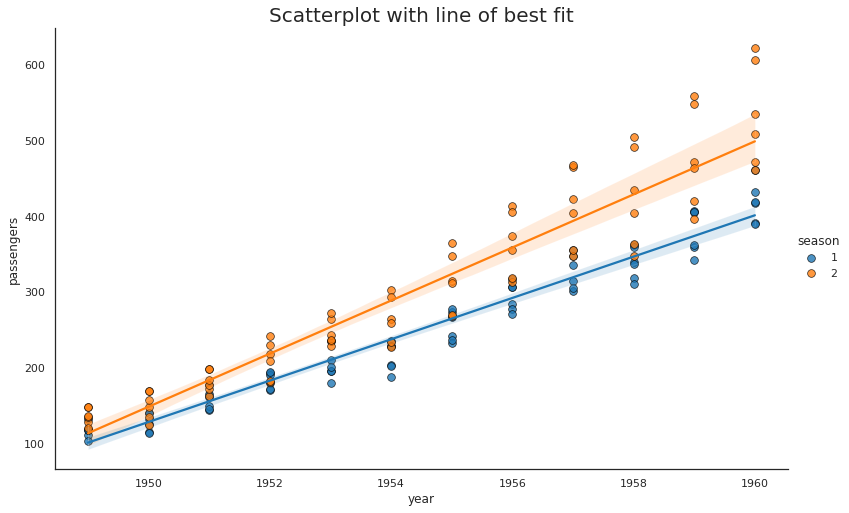
To add title and axis labels in Matplotlib and Python we need to use plt.title() and plt.xlabel()
Steps
- Import libraries
- Prepare Data
- Select columns X and Y
- Map values to categories
- Select chart type
- Set Style
- chart height
- aspect
- colors
- points decoration
- Add title
- Show plot
More information can be found: Creating multiple subplots using
Data
We are loading the seaborn dataset for flights. Additionally we are mapping the month to season in order to get categorical data.
| year | month | passengers | season | |
|---|---|---|---|---|
| 0 | 1949 | Jan | 112 | 1 |
| 1 | 1949 | Feb | 118 | 1 |
| 2 | 1949 | Mar | 132 | 1 |
| 3 | 1949 | Apr | 129 | 2 |
| 4 | 1949 | May | 121 | 2 |
Example
To plot scatter plot with best fit line we use:
sns.lmplot()- provide X and T
plt.ylabel('Y')
Full example:
import numpy as np; np.random.seed(0)
import matplotlib.pyplot as plt
import seaborn as sns; sns.set_theme()


flights = sns.load_dataset("flights")
flights['season'] = flights['month'].map({"Jan":1, "Feb":1, "Mar":1, "Apr":2, "May":2, "Jun":2, "Jul":2, "Aug":2, "Sep":2, "Oct":1, "Nov":1, "Dec":1, })

sns.set_style("white")
gridobj = sns.lmplot(x="year", y="passengers", hue="season", data=flights,
                     height=9, aspect=1.6, robust=True, palette='tab10',
                     scatter_kws=dict(s=100, linewidths=.9, edgecolors='black'))

plt.title("Scatterplot with line of best fit", fontsize=20)
plt.show()
Output


