In this guide you can find how to use Scatterplot and Kmeans in Python. We can see several examples on Scatterplot and Kmeans with matplotlib.
Scatterplot and Kmeans basic example
First we will start with imports of all libraries. Then we will read the data and visualize it by:
import pandas as pd
import numpy as np
import matplotlib as mpl
import matplotlib.pyplot as plt
from matplotlib.pyplot import figure

# import dataset
df = pd.read_csv("https://raw.githubusercontent.com/softhints/dataplotplus/master/data/happyscore_income.csv")

df[['country', 'GDP', 'happyScore', 'region', 'avg_income']].head()
data:
| country | GDP | happyScore | region | avg_income |
|---|---|---|---|---|
| Armenia | 0.76821 | 4.350 | 'Central and Eastern Europe' | 2096.76 |
| Angola | 0.75778 | 4.033 | 'Sub-Saharan Africa' | 1448.88 |
| Argentina | 1.05351 | 6.574 | 'Latin America and Caribbean' | 7101.12 |
| Austria | 1.33723 | 7.200 | 'Western Europe' | 19457.04 |
| Australia | 1.33358 | 7.284 | 'Australia and New Zealand' | 19917.00 |
Next we are going to define variables for the Kmeans analysis and the scatterplot. In this case we are searching for answer of:
- Is there a relation between happiness and GDP of a given country
# set the x and y variables
col_x = 'happyScore'
col_y = 'GDP'
Calculate the standard deviation and the mean
The standard deviation and the mean might be helpful when you work with Kmeans. We are going to find them by using Pandas methods:
.mean().std()
We need the mean and the standard deviation for both variables:
# calculate the standard deviation and the mean
x_mean = df[col_x].mean()
x_stdev = df[col_x].std()

y_mean = df[col_y].mean()
y_stdev = df[col_y].std()

print(x_mean, x_stdev)
print(y_mean, y_stdev)
result:
5.421909909909912 1.180800549315818
0.8419090990990992 0.3875905043131557
Calculate the normalized values
Next we are going to find the normalized values for both variables by Python and simple formula:
# calculate the normalised values on x and y
x_min = min(df[col_x])
x_max = max(df[col_x])

norm_x = ((df[col_x] - x_min)/(x_max - x_min))
df['norm_x'] = norm_x

y_min = min(df[col_y])
y_max = max(df[col_y])

norm_y = ((df[col_y] - y_min)/(y_max - y_min))
df['norm_y'] = norm_y
result of norm_y:
0      0.486184
1      0.479449
2      0.670414
Create Kmeans Clusters centers
For Kmeans we are going to use the library sklearn and it's class KMeans. In this example we will have 2 clusters which are set by n_clusters=2.
# create Kmeans clusters
from sklearn.cluster import KMeans

x_y = np.column_stack((df['norm_x'], df['norm_y']))

km_res = KMeans(n_clusters=2).fit(x_y)
clusters = km_res.cluster_centers_
clusters
The cluster information:
array([[0.74214874, 0.73933614],
       [0.35627928, 0.33903262]])
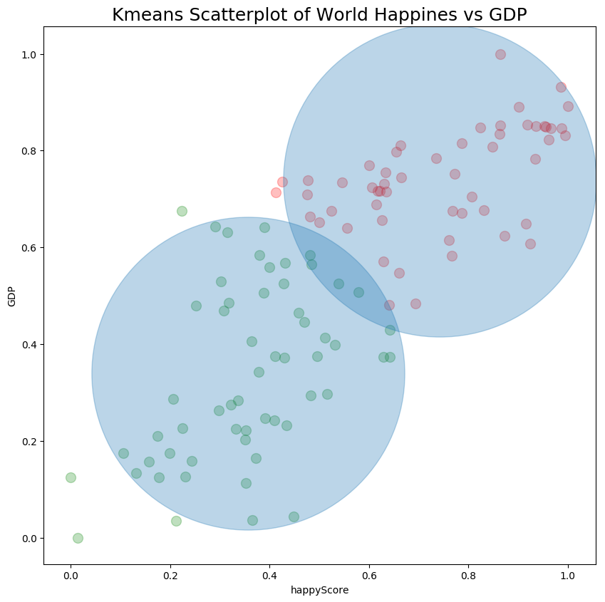
Plot Scatterplot and Kmeans in Python
Finally we can plot the scatterplot and the Kmeans by method plt.scatter. Where:
df.norm_x,df.norm_y- are the numeric variables for our Kmeansalpha = 0.25- is the transparency of the points. Which is useful when number of points grows = 100- size of the data pointscolor='red'- color of the data points
figure(num=None, figsize=(10, 10), dpi=100, facecolor='w', edgecolor='k')

plt.xlabel(col_x)
plt.ylabel(col_y)

plt.scatter(df.norm_x, df.norm_y, alpha = 0.25, s = 100, color='red')
plt.title("Kmeans Scatterplot of World Happiness vs GDP", fontsize=18)
plt.scatter(clusters[:,0], clusters[:,1], s = 100000, alpha=0.30)
result is:
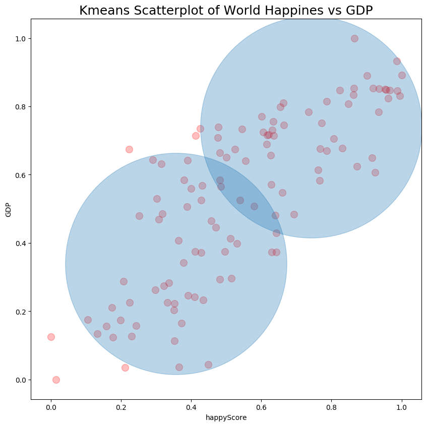
Plot data points in different colors - Optional
If you like to plot the cluster points in different colors with Scatterplot we can mark the DataFrame rows with the corresponding cluster labels by:
df['cluster'] = km_res.labels_
df1 = df[df['cluster'] == 0]
df2 = df[df['cluster'] == 1]
Then we will create two temporary DataFrames with the data for each cluster.
Finally we can plot data for each cluster in a different color:
figure(num=None, figsize=(10, 10), dpi=100, facecolor='w', edgecolor='k')

plt.xlabel(col_x)
plt.ylabel(col_y)

plt.scatter(df1.norm_x, df1.norm_y, alpha = 0.25, s = 100, color='red')
plt.scatter(df2.norm_x, df2.norm_y, alpha = 0.25, s = 100, color='green')
plt.title("Kmeans Scatterplot of World Happiness vs GDP", fontsize=18)
plt.scatter(clusters[:,0], clusters[:,1], s = 100000, alpha=0.30)
result: